
 Left Navigation Menu

Compare the Cost of Living in Different Areas
Overview
The cost of living comparison tool helps you see how expensive it is to live in different places if you’re thinking about moving, starting a new job, or going to school in a new place. It compares things like housing, food, and transportation between two cities. It helps you know if your money goes farther—or if you’ll need a bigger budget.
Where to Find This Feature
-
Left navigation menu > Services for Individuals > Financial Services >Cost of Living Comparison
-
My Dashboard > Widgets > Financial Services > Cost of Living Comparison link
-
Directory of Services tab > Services for Individuals > Financial Services icon > Cost of Living Comparison icon
-
Footer > Services > For Individuals > Financial Services icon > Cost of Living Comparison icon
Steps to Compare the Cost of Living
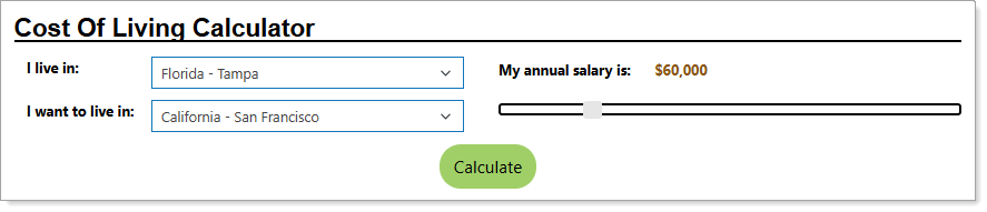
Entering Locations and Salary for Comparisons
Your site may display different options from those shown here.
-
Select from the drop-down list the location you currently live in.
-
Select from the drop-down list the location you would like to live in.
-
Using the slider, select your annual salary by moving the vertical white bar. The salary figure automatically displays where you are on the slider, as you move it.
-
When you have finished your picks, select the Calculate button to display detailed labor market information relevant to the cost of living for the two areas.
Understanding the Cost of Living Comparisons
Sample Cost of Living Comparison
|
Section |
Description |
|---|---|
|
Employment Wage Statistics |
The median wage is the middle pay level. This means half of the workers in a job make less than this amount, and half make more. The 10th and 90th wage numbers show typical pay near the low end and high end of what people earn in that job:
|
|
Comparable Salary |
Lists your current salary, which you entered in the steps above, and how much you need to earn to preserve your standard of living. |
|
Cost of Living |
Lists the percentage higher or lower the baseline cost of living is between your two locations. |
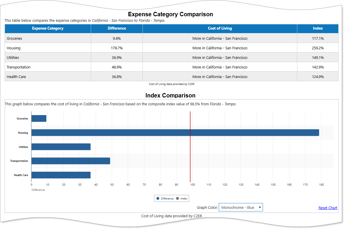
| Expense Category Comparison |
Expense Category Comparison for cost of living looks at five main spending areas: groceries, housing, utilities, transportation, and health care. Each category is compared to the national average. You can compare different places by looking at each category’s Index value:
To see how this affects your overall budget between two places, look at the Difference for each category and notice how much higher or lower it is. |
| Index Comparison | This bar chart graphs the Difference and Index values from the previous section to portray a visual view. Click the Difference or Index button below the chart to choose which is displayed. |
| Comparable Salary Area Distribution |
This table lists different Areas and the Comparable Salary you would have to make to match your standard of living based off where you currently live with your current salary. These locations listed are nearby the place you selected you want to live. A Difference field tells you how much higher or lower your salary must be in the new locations to match what your current salary can purchase where you live now. The graph below the table plots the Comparable Salary or Difference when you select either button in a bar chart. You can also change the Graph Color using the drop-down list. |
| Index Area Distribution |
This table lists different Areas and the five main spending areas, plus a Composite score detailing the increase in cost over the national average of areas nearby you indicated you want to live. The graph below the table shows this increase or decrease over the national average, where 100% is the national average. You can choose between the categories shown using the buttons below the bar chart. You can also change the Graph Color using the drop-down list. |